
Ernst Haas: Color Correction: 1952 - 1986
Product ID: 35623100
Desertcart purchases this item on your behalf and handles shipping, customs, and support to Hong Kong.
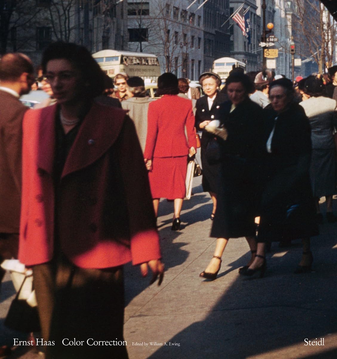
Ernst Haas is one of the best-known, most prolific and most published photographers of the 20th century. He is famed for his vibrant color style, which, for decades, was much in demand by the illustrated press. This work, published in the most influential magazines in Europe and America, also produced a constant stream of books, and these too enjoyed great popularity. But although his color work earned him international fame, in recent decades it has been derided as "overly commercial" or not sufficiently "serious." Yet there was a side of Haas’ work almost entirely hidden from view: parallel to his commissioned work, he made images independently, images far more edgy, loose, complex, ambiguous and radical than the work for which he is famed. Hass never printed these pictures in his lifetime, nor did he exhibit them, perhaps believing that they would not be understood or appreciated. This volume, intended to "correct" the record, compiles these photos of great complexity for the first time in print. Ernst Haas (1921–86) was an Austrian-born artist who enjoyed a 40-year career as a photojournalist and creative photographer. A self-trained photographer, Haas first began to photograph his native Vienna in the aftermath of World War II. He published in various magazines before joining Magnum Photos, of which he would eventually become president. In 1950 Haas traveled to New York for a project and remained there for the rest of his life. The Museum of Modern Art presented a ten-year survey of his color photography in 1961―its first solo-artist retrospective dedicated to color work. Review: The joy of color - The idea for this wonderful book of photos came from Graham Howe in 2005, he suggested it focus on the more abstract images that Haas had taken over three decades, most of which had not been seen before. The title is a reprint of the 2011 Steidl edition, and now, fortunately, you don't have to pay the large sums that the original sells for. What I find so fascinating about these photos is the way Haas captures the commonplace, here are shots from the man-made landscape available for everyone to see but, of course, we don't, it takes the eye of a very creative photographer to bring it to our attention. In Philip Prodger's essay he says Haas frequently went out to take photos for himself and the majority of the 186 pictures in the book are in this style. Throughout the pages there is an excellent selection of surface work (rather reminiscent of the close-up texture photos by Aaron Siskind) detail from torn posters, peeling paint, fragments of leaves, sidewalk detritus. What gives this work an extra lift is the way Haas creates depth by having the background out of focus and a shape in the foreground, add some black around the edges and suddenly the picture on the page is more intriguing yet it could just be a painted number on a wall. The earliest work is from 1952, the last from 1986. I recognized four (there maybe more) from the two long photo essays about New York that appeared in the September 14 and 21, 1953 editions of Life (incidentally you can see these on Google, it has archived all the issues of the magazine). I would guess that three-quarters of the book's contents are of the US and especially New York and other work from Europe. The back pages have a location and date caption but as Prodger says 'Because of the way he photographed, it is impossible to tell where he made a given photograph based on appearance alone. Haas often took his pictures inches away from the subject at acute and unexpected angles.' 'Color correction' is a book of remarkable photos, especially as most of them have not been seen before and I think they reveal much more about Haas art than his best selling 'Creation' or 'In America' books. Review: Best colour book of Ernst Haas - This is a wonderful book in a format that is pleasing Each picture is printed in a page of its own and in a size not too big as to completely overwhelmed the page leaving no white border . Colour reproduction is high quality living to the standard of the original Kodakchrom colour . I have several books on ErnstHaas photographs and this one really exceeded them in terms of colour reproduction and presentation
| Customer Reviews | 4.9 out of 5 stars 23 Reviews |
R**N
The joy of color
The idea for this wonderful book of photos came from Graham Howe in 2005, he suggested it focus on the more abstract images that Haas had taken over three decades, most of which had not been seen before. The title is a reprint of the 2011 Steidl edition, and now, fortunately, you don't have to pay the large sums that the original sells for. What I find so fascinating about these photos is the way Haas captures the commonplace, here are shots from the man-made landscape available for everyone to see but, of course, we don't, it takes the eye of a very creative photographer to bring it to our attention. In Philip Prodger's essay he says Haas frequently went out to take photos for himself and the majority of the 186 pictures in the book are in this style. Throughout the pages there is an excellent selection of surface work (rather reminiscent of the close-up texture photos by Aaron Siskind) detail from torn posters, peeling paint, fragments of leaves, sidewalk detritus. What gives this work an extra lift is the way Haas creates depth by having the background out of focus and a shape in the foreground, add some black around the edges and suddenly the picture on the page is more intriguing yet it could just be a painted number on a wall. The earliest work is from 1952, the last from 1986. I recognized four (there maybe more) from the two long photo essays about New York that appeared in the September 14 and 21, 1953 editions of Life (incidentally you can see these on Google, it has archived all the issues of the magazine). I would guess that three-quarters of the book's contents are of the US and especially New York and other work from Europe. The back pages have a location and date caption but as Prodger says 'Because of the way he photographed, it is impossible to tell where he made a given photograph based on appearance alone. Haas often took his pictures inches away from the subject at acute and unexpected angles.' 'Color correction' is a book of remarkable photos, especially as most of them have not been seen before and I think they reveal much more about Haas art than his best selling 'Creation' or 'In America' books.
A**R
Best colour book of Ernst Haas
This is a wonderful book in a format that is pleasing Each picture is printed in a page of its own and in a size not too big as to completely overwhelmed the page leaving no white border . Colour reproduction is high quality living to the standard of the original Kodakchrom colour . I have several books on ErnstHaas photographs and this one really exceeded them in terms of colour reproduction and presentation
J**S
Greatness
I wish I could have met him. He is my favorite photographer of all time. I like a few of his books a little better, but he is magnificent.
P**K
Second Edition
This is a review of the second edition. Ernst Haas' color work is incredible and the production of this book is amazing. Grab one before it goes out of print again.
K**B
Haas is always worth looking at, but...
Thanks to certain photograph(s) in this book having been previously reproduced in Haas' earlier books-at least one in "The Creation", that I can tell- I can report that the color reproduction quality of "Ernst Haas: Color Correction" is poor. Even shots that I am fairly sure were made on the relatively fade-free Kodachrome are reproduced here with a faded, sapped-out color that degrades the experience of viewing, especially for those newly exposed to Haas' work. I can't say 'Don't buy it', but try to see earlier copies of "The Creation" or "In America" in order to see what the color really looked like. Is it possible that "Color Correction" contains the best possible modern, circa 2010 color reproductions of Haas' work? Yes, but I doubt it.
P**I
Fantastic
very interesting attitude to color photography nice and attractive inspiration for other photographers pictures absolutely fantastic I love it .
F**Y
Beautiful
This is a wonderful book. Beautifully made and printed as befits the photographs. Hass was there first and it is about time he was recognized fully. This book is a start.
T**L
Ohhhh, Yeaaahhhh.... This is the Most Important Photo Book of 2011 and It's Reissue Is Just As Important
Comments on this important reissue: See below my extensive review from 2011. This reissue by Steidl, one of the very best publishers of fine photo books, is important. The first printing sold out in about two weeks. This reissue emphasizes a renewal or rediscovery of Ernst Haas and is a strong reassertion of his importance in the History of Photography. He has been ignored for too long in favor of more "avant garde" photographers, such as Eggleston and Leiter - both important, but cannot and do not challenge Haas's depth and breadth of contributions to photography in the mid-20th Century. I hope that the younger generation of photographers, amateur, student, and professional will delight in Haas's work, much of it in this book not published previously, as I have. His more recent book, "On Set," is also a most important book just covering his extensive coverage of dozens of movies from the 1950s and later. Directors and actors/actresses specifically sought out Haas for his stills. My guess is that this reissue will also sell out quickly. My 2011 Review: Firstly, allow me to say that amazon doesn't have enough stars to account for my real feelings about this book. When I opened Haas's first book, "The Creation," the first time, it was to photos 22/23 at a small book store in Cherry Valley, NY in June, 1972. And my jaw dropped involuntarily. I couldn't believe that image 23 could have been made with a camera. To the beginning, the opening image across both pages, of the universe in an abalone shell - one of the iconic images of color 35mm photography - unworldly. My jaw stayed distended as I continued to leaf through the book, followed, of course, by my purchase. Ernst Haas is my Number One photographic personal hero, and has been for more than 40 years. No one's images are so satisfying to me on so many levels as Haas's. His photography is to me as Beethoven's music. It resonates in my visual processing system at a level close to primeval. It is satisfying at an intellectual level, visual architecture level, spiritual level, and something, somewhere more visceral. I never get tired of his images. So, it is almost an emotional experience to receive finally this magnificent, long overdue book, and to experience, once again with many new images, some of what I felt with that first leafing through of "The Creation." For those of us in the Post War Baby Boom Generation (PWBBG) who became photographers as professionals or amateurs, I would guess that almost every one of us who chose color was inspired by EH, if not to take up photography in the first place, then it was his work that lit the real fire in our bellies. The great majority of the images in this book have not been published before. The portfolio section is arranged in twelve parts, the logic for which escapes me, but it does give one's eye moments of relief from concentrating on the images. And what images they are! Dozens of his straight abstracts and often incomprehensible multi-reflections. And so many other styles and categories. Looking through these, I see bits of many other photographers' works already seen or imagined in these images; it is uncanny. The curator of this selection, William Ewing, used the term "loose," as one of several adjectives, to describe the flavor of what he found in the Getty archives of some 200,000 images. But "loose" does not begin to describe the exactness of Haas's in-camera framing of these images. Many left me wondering what kind of mind was even capable of seeing such possibilities, let alone the technical acumen to record them as images. EH invented small format color photography - at least in the sense that he was the first to show wildly new dimensions of what was possible, in seeing and making the image from Kodachrome's earliest days on the market. His essays in Life magazine in 1953, the year after my birth, were breakthroughs; Life in his first essay on NY had until then never dedicated so many pages and so many images to a single article, and to follow the next week with a longer one, broke Life's practice, then, on two fronts. And it just kept on going. So many contemporaries and younger photographers' work show Haas's influences. There were over a dozen photo essays in Life and Look magazines, with essays or photos in many others, too. His first book, "The Creation," may still hold the title of the best selling photography portfolio book ever, with over 350,000 sold world wide in the hardcover and paperback versions. An image from that book, of impala in an East African game reserve, was the first 35mm frame that Kodak made into a 20' x 30' - yup, that's feet - backlit transparency that graced their advertising space in New York's Grand Central Station for several years in the late 1970s to early 80s, if I remember correctly. Twenty feet by thirty feet from one Kodachome image! Amazing then, and still rather mind boggling now. He was one of the most versatile photographers going: commercial, illustrative, books, teaching, exhibitions, and more. People by the millions loved his work, and those, unfortunately not I, who had the privilege of having spent personal time with him at the workshops he used to host, loved him. And then he ran up against the critical elite. Anyone whose work was enjoyed by so many people across so many media obviously couldn't have been "serious," or "relevant," or "avant garde" enough. No, no. Starting with John Szarkowski, and followed by the likes of Sally Eauclaire and Max Kozloff, his work was progressively denigrated and sidelined through the 1970s and following decades. He always maintained a loyal following, but the effete ones with their noses in the air, brilliant as they were, trivialized his work. Fine of Szarkowski to have been one, as a recent book of his photography shows quite clearly that he fits with consistency an old stereotypical statement, that "Those who can't do either teach or critique." Not to insult teachers, though. And his photography is competent. Several compilations of the most significant photographers by some criteria or other fail to include Haas - even of Life magazine photographers. Incredible, just plain incredible. The publication of this book puts paid to any possible denigrative statement from any critic whomsoever. It opens for us more than ever before a window on Haas's deep intelligence, brilliancy of seeing - both compositionally and with underlying message, across every major artistic movement and style of his era and even before, at a spiritual level no one else could touch. The emergence of his private work, which, according to Prodger, Haas kept to himself, blows apart those earlier critical putdowns, showing he was ahead of or a deeper master of the work of any successor. He out banals Eggleston and outsees by many a mile the likes of Steven Shore and Joel Meyerowitz. If Haas had let these images be published or shown in his lifetime, the New Photography critics would have had to find someone else to beat up to make the space for their favorites. Unlike the practitioners of Eauclaire's "New Color Photography," Haas loved black in his images. So many of his images are thick with black, the content revealing itself in contrasts, through rich, deep color. The New folks liked their images to be more evenly exposed, without the massive, deep shadows that Haas used so well. Prodger's essay in the back is brilliant, detailed, and thorough. I have only a minor bone to pick, with a detail. "R" cameras didn't come into being until 1976 with the Leica R3. Earlier reflex Leicas were "Leicaflex" cameras, Standard, SL, and SL2, and I know that he used at least the SL and SL2 cameras. By the time of his untimely demise, he was using R Leicas. Before the advent of Leica's reflex cameras, Haas used Leica rangefinder cameras and, apparently, Pentax Spotmatics with adapted Leica lenses for his color work. I predict this book to sell out. Once again, Steidl shows that they are at the forefront of the finest photographic publications. Anyone photographer raised in the PWBBG will want this book. The only way it could be better is for Steidl to give us so much more of Ernst Haas, one of the finest, most significant photographers of the Twentieth Century.
A**D
Extraordinary Book
The Work of Ernst Haas is exceptional. He captures the essence of his subjects in light form and color. It is one of the best photo books.
Y**U
すごくいい
すごくいい 素晴らしい The Creationなんかは逆にあまり好きになれないんですが、これは良い。 主にニューヨークのスナップ The Creationへ続く萌芽が既に見て取れ、 しかも、ここ最近のWillam EgglestonからTillmansまでが見つけられる。 実に多くの可能性と側面をもつ写真集 ニューカラーの決定版のひとつに追加だ!
L**E
Imprescindible
Un libro que no puede faltar en la biblioteca de cualquier aficionado a la fotografía. Cada imagen es una pequeña obra de arte, un deleite para los ojos. El envío fue perfecto, en la fecha prometida.
Y**K
Très beau livre
Belle qualité de reproduction des photos. Beau livre. Attention textes en anglais. Le choix des photos montre à quel point les nombreux photographes amateurs actuels ont intégré les cadrages et choix de sujets d'Ernst Haas dans leurs démarches.
R**N
The joy of colour
The idea for this wonderful book of photos came from Graham Howe in 2005, he suggested it focus on the more abstract images that Haas had taken over three decades, most of which had not been seen before. The title is a reprint of the 2011 Steidl edition, and now, fortunately, you don't have to pay the large sums that the original sells for. What I find so fascinating about these photos is the way Haas captures the commonplace, here are shots from the man-made landscape available for everyone to see but, of course, we don't, it takes the eye of a very creative photographer to bring it to our attention. In Philip Prodger's essay he says Haas frequently went out to take photos for himself and the majority of the 186 pictures in the book are in this style. Throughout the pages there is an excellent selection of surface work (rather reminiscent of the close-up texture photos by Aaron Siskind) detail from torn posters, peeling paint, fragments of leaves, sidewalk detritus. What gives this work an extra lift is the way Haas creates depth by having the background out of focus and a shape in the foreground, add some black around the edges and suddenly the picture on the page is more intriguing yet it could just be a painted number on a wall. The earliest work is from 1952, the last from 1986. I recognized four (there maybe more) from the two long photo essays about New York that appeared in the September 14 and 21, 1953 editions of Life (incidentally you can see these on Google, it has archived all the issues of the magazine). I would guess that three-quarters of the book's contents are of the US and especially New York and other work from Europe. The back pages have a location and date caption but as Prodger says 'Because of the way he photographed, it is impossible to tell where he made a given photograph based on appearance alone. Haas often took his pictures inches away from the subject at acute and unexpected angles.' 'Color correction' is a book of remarkable photos, especially as most of them have not been seen before and I think they reveal much more about Haas art than his best selling 'Creation' or 'In America' books.
Trustpilot
2 days ago
1 day ago